RoshPack E-commerce
An e-commerce website for a Pakistan-based packaging company.
My role
UX Design Freelancer
Team size
Solo project
Timeline
2 months
Tools
Figma

Project overview
RoshPack is a Pakistan-based company that specializes in creating custom packaging. Looking to revamp its e-commerce website, RoshPack brought me onto the team as a UX designer.
As the sole designer on this project, my responsibilities included enhancing the website's visual design, improving navigation, and ensuring the overall experience was cohesive and tailored to the needs of the Pakistani market.
For this project, I developed a design system, wireframes, high-fidelity mockups, and an interactive prototype with over 50 frames—all within two months.
Please note that client asked to only focus on a desktop design as that is the preferred device for customers in Pakistan.
Problem
RoshPack's original e-commerce website faced several critical challenges. According to the client, the visual design felt outdated and lacked a professional touch, making the company appear inexperienced and untrustworthy—an especially significant concern given that Pakistani customers are already skeptical about online shopping.
Additionally, the navigation system failed to align with how the products were intended to be categorized, causing confusion for users. The client also noted that the call-to-action buttons and lead generation forms did not stand out enough, resulting in missed opportunities to drive customer engagement.
Original website


Goal
After speaking with the client, the key goals for the website redesign include:
Modernize the visual design to establish credibility and appeal with a clean, professional aesthetic.
Reorganize the navigation system to reflect proper product categorization and improve usability.
Enhance calls to action to increase lead generation and encourage visitors to engage with the "Contact Us" page.
Catering to the Pakistan market
Building trust
In Pakistan, customers are often wary of online shopping and e-commerce websites, preferring to contact companies directly via phone or email to ask questions and place orders. To address this behaviour, I made "Call us now" and "Contact us" the most prominent calls to action across the website.
This design decision supports RoshPack's strategy of encouraging direct communication. Highlighting phone calls and the website’s live chat feature allows RoshPack to build trust with its customers, resolve concerns in real time, and establish stronger, more personalized relationships.

Establishing credibility
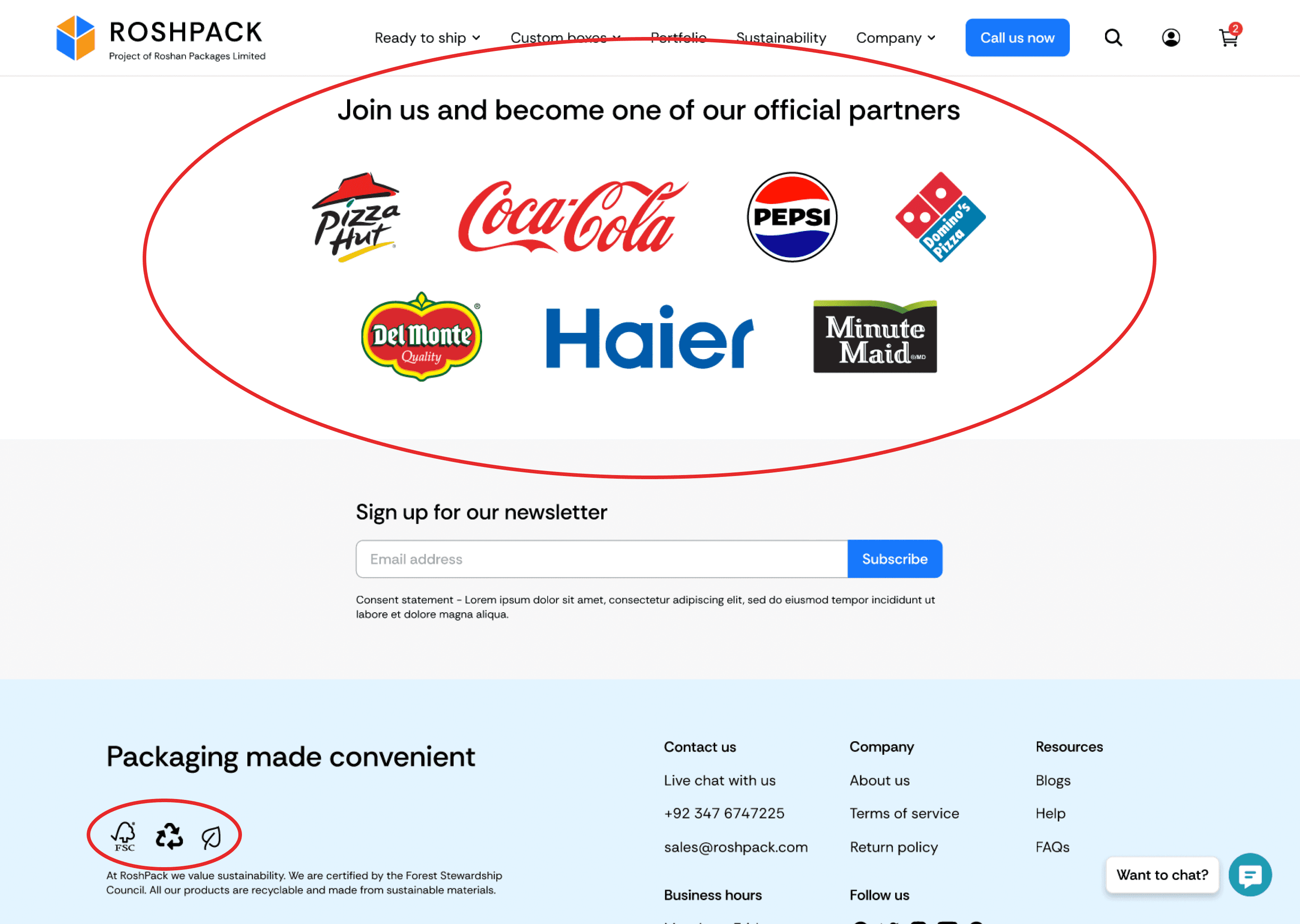
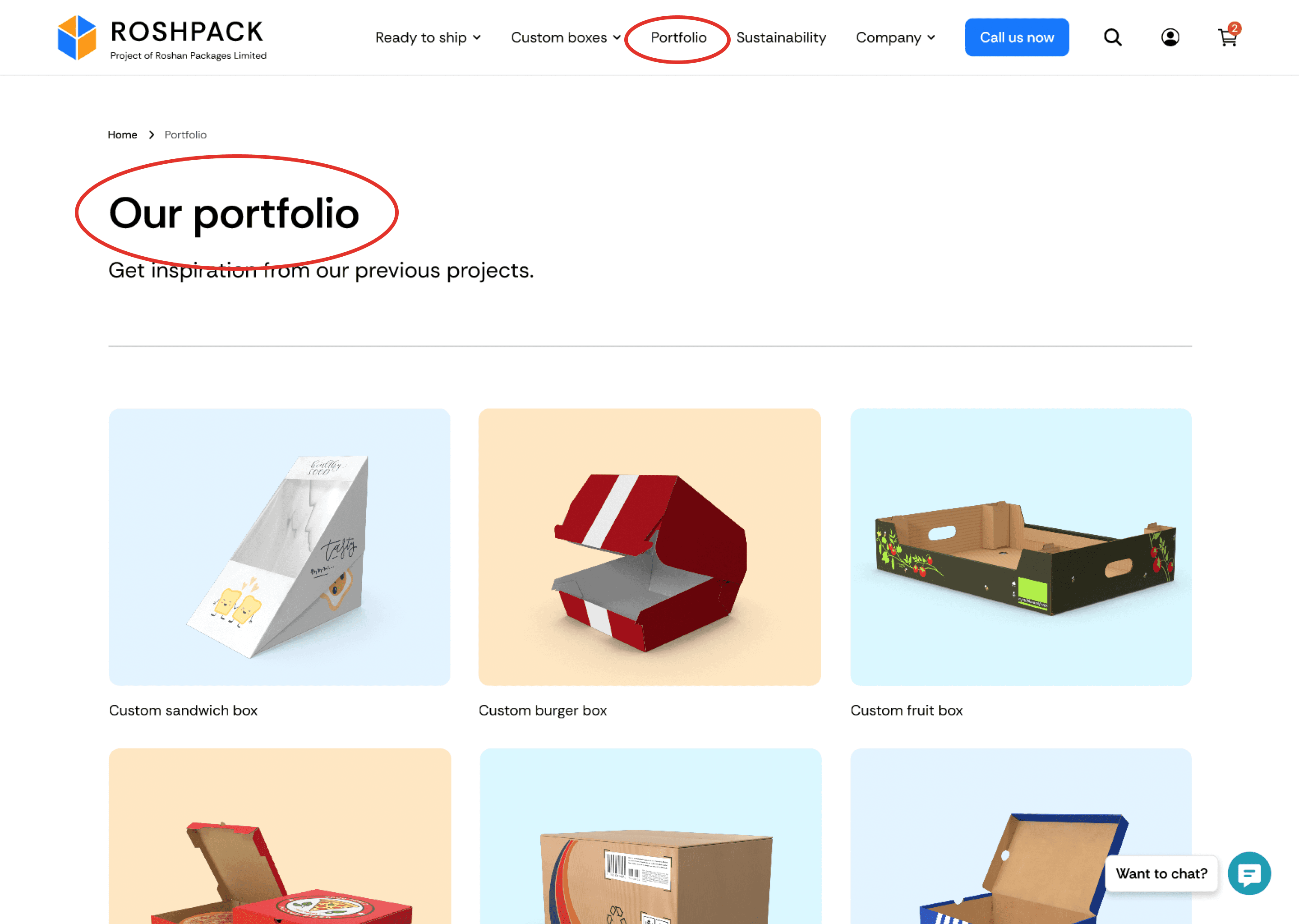
Building trust is essential, but equally important is establishing credibility to reassure customers of RoshPack's reliability. To achieve this, the website prominently displays logos of reputable companies they’ve partnered with, earned certifications, and a portfolio page showcasing past projects. Additionally, client testimonials are featured to leverage the power of social proof, further enhancing RoshPack's credibility.
These elements serve as tangible proof of RoshPack's expertise and professionalism, addressing the skepticism often exhibited by Pakistani customers. By highlighting their partnerships, credentials, and success stories, the website reinforces the message that RoshPack is a credible and trustworthy company worthy of its business.
Use colours that evoke professionalism and trust
Blue often signifies professionalism. A combination of blue and yellow/orange reminds us of mega brands such as Walmart, RBC, Ikea, Visa, and more. While this colour combination can feel overused, in the Pakistani market, this can serve as a benefit. The Pakistani market does not easily trust companies, however, using colours similar to other established brands, can evoke a sense of trust in RoshPack.
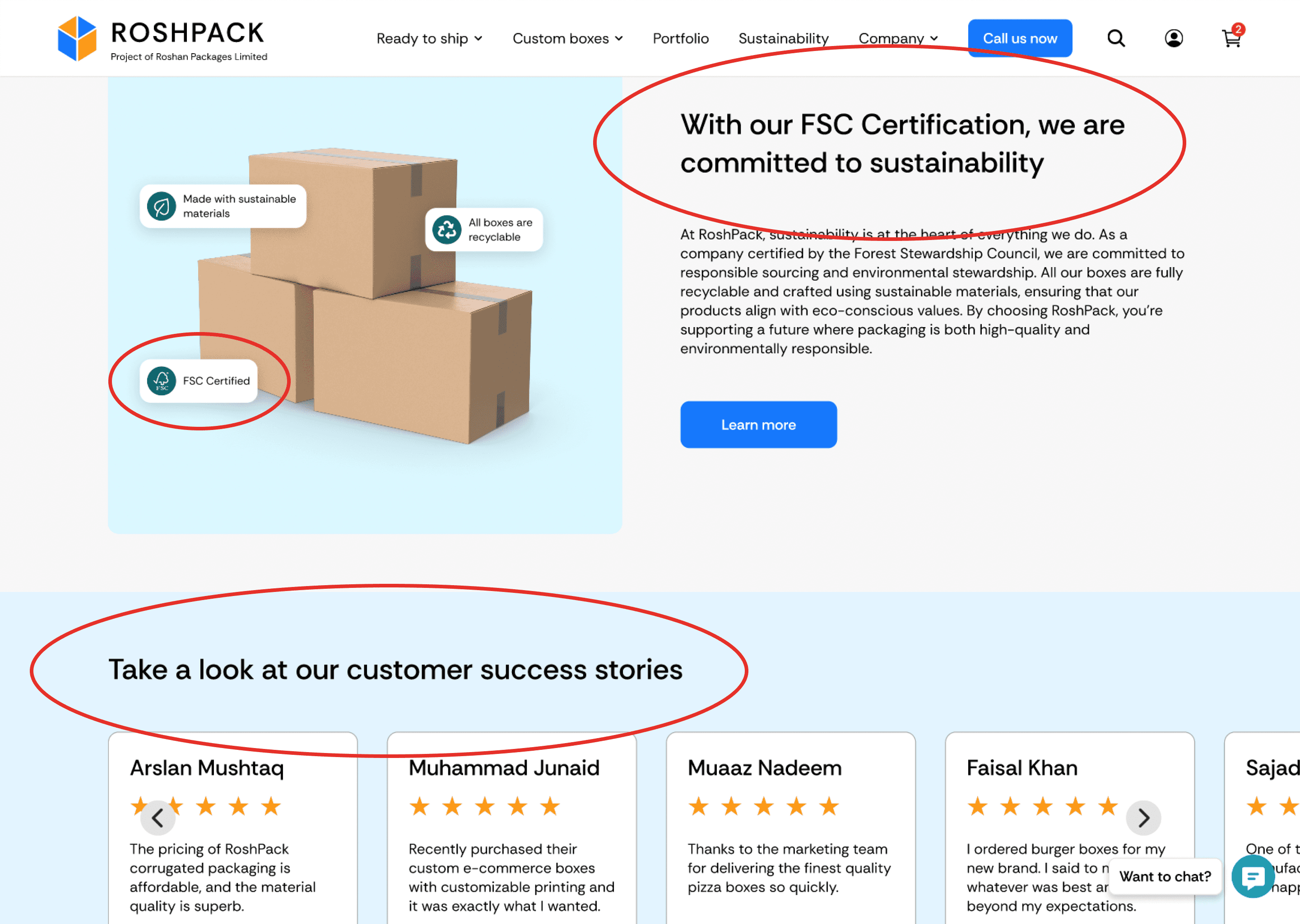
RoshPack also places a strong emphasis on sustainability, and the use of teal in the design helps communicate this value effectively. Teal strikes a balance between green and blue, subtly evoking the sustainability sentiment associated with green while maintaining harmony with the primary blue colour. Using teal avoids the visual conflict that can arise from combining bold shades of green and blue, where each might compete for attention. Instead, teal integrates seamlessly into the colour palette, reinforcing RoshPack's commitment to sustainability without overpowering the overall design.
#1778FB
#FB9817
#1D9CB1
Simplifying interactions
Since Pakistani customers are often skeptical of using e-commerce websites, I aimed to simplify the site's interactions to prevent additional frustration for users. One example of this is the navigation bar.
On many e-commerce websites, hovering over a tab label triggers a dropdown menu. However, this interaction can sometimes feel glitchy and frustrating for users. To simplify the experience, I implemented a click-to-expand feature for the dropdown menu.
Additionally, adding arrows next to tab labels serves as a clear visual cue, indicating whether a specific tab has a dropdown menu associated with it.

Design process
Meet with clients
Meet with the clients to understand project concerns and goals.
Research on Pakistan market
Do research on the Pakistan market to better understand consumer behaviours.
Design system
Create a new design system to establish the visual core of the redesigned website.
Wireframes
Create wireframes that outline the new navigation and page designs.
High-fidelity prototype
Create a high-fidelity prototype that mimics the feel of the website.
Handoff to developers
Create handoff notes that outline design and interaction details for developers.
Design system


The design system communicates the visual core of the website, providing a cohesive framework for all elements across the platform. It ensures consistency throughout the entire project by defining key aspects like colour schemes, typography, spacing, and UI components.
This consistency is essential for creating a seamless user experience and reinforcing the brand's identity. The minimalistic design style of the UI elements aligns perfectly with the client's request for a clean and professional look, allowing the website to feel modern, user-friendly, and visually polished.
Typography

Throughout the website, I used "Rethink Sans", a sans-serif font that is simple, clean, and easy to read. This choice aligns with the client's request for a modern, professional aesthetic. The font's minimalistic design enhances readability, ensuring that the website remains user-friendly while maintaining a sleek, contemporary look.
Wireframes


Creating wireframes was a necessary step for this project as they provided a clear outline of the site's architecture, page layouts, and user flows. Additionally, wireframes facilitate more effective communication with the client, ensuring that the work aligns with their goals and expectations. Given the complexity of the user flows for this particular project, wireframes proved to be an invaluable tool in collaborating with the client to resolve any issues and refine the design.
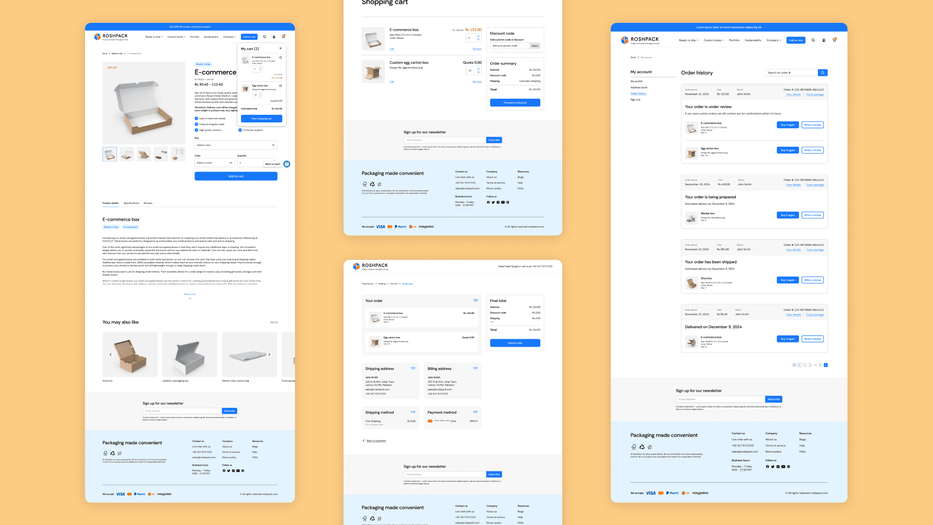
High-fidelity prototype


The next step for this project was to create a high-fidelity, interactive prototype. This step was crucial for visualizing the final design and functionality of the website before moving on to development. When building prototypes, I aim to create a fully polished product, with finalized visuals, copy, and interactions. I want my prototypes to feel as close to a real product as possible, despite the limitations of Figma. This allows clients to experience how the final product will look and function, providing an opportunity for feedback and adjustments before committing time and resources to development. Additionally, the prototype serves as a clear reference for developers, showcasing visuals and interactions that can be accurately translated into code, ensuring that the design intent is preserved.
Handoff to developers


To complete the project, I created detailed handoff notes for the developers. This document serves as a comprehensive roadmap, ensuring the final product aligns with the design intent. In the handoff notes, I include key details about interactions, animations, UI specifications, and user flows, providing developers with the necessary information to accurately implement the design.